Design Review — new rupee notes

And it’s here. The new Indian currency notes of rupees 2000 and 500 are in circulation after PM Narendra Modi’s historic announcement last week. Designers have already lambasted the graphic design of the new notes as ‘not noteworthy’ and as ‘vintage and brutalist’. What follows is my critique of the design of the new notes. I have avoided some points which have already been pointed out by others. Also I have compared the new note with the old ones and derived a few meaning from the comparison.
Shifting Gandhi:
‘They have shifted Gandhiji’ that was my first reaction when I saw the new notes online before I could touch them at a Haldirams. The Mahatma once nestled in the far right and looking to the left side of the note has now been moved to almost the center of the notes.
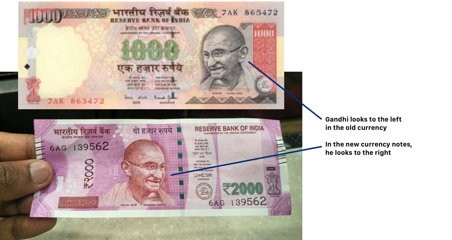
Is RBI/ Modi trying to convey something with this? Incidentally it is this photograph of Gandhiji taken with Lord Frederick William Pethick-Lawrence in 1946 which is used to create the profile of Gandhiji’s face that we see in the currency notes.

What may have lead to this shift? — it made me wonder. Did the right wing government wanted to make Gandhiji look to the right? Why did they move him? What was the conversation which lead to this decision?
Sometime in August 2016, somewhere in the PM’s office
Modi: Mitron, Gandhiji is looking right in the photo. Then why is he looking left in the currency note?
RBI currency designer: Sir, we manipulated the photograph, made a mirror image so he can be on the left side. This way it looks like he is looking at the entire note.
Modi: Already people before me have manipulated him a lot. Lets just use the same profile. Just put him in the center.
RBI: Sir, it’s not a perfect circle or rectangle. A perfect form will be better in the centre. So...
Modi: Teek hai, put him almost to the centre. That will do.
The overall kichadi of elements:
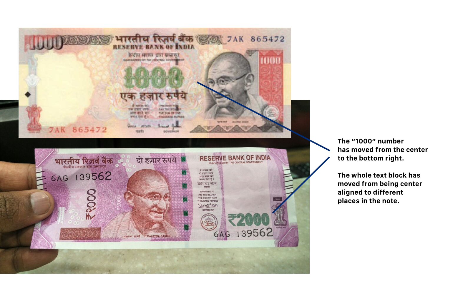
As pointed by the Beard design critique, there is no central visual aesthetic in the new notes. Also the elements of the note are in conflict with each other (Just like in India?). The circular ‘ripple lines’ in the background gets abruptly cut by the white rectangle in the right. The readability of the hindi text of Reserve Bank of India is compromised because of the dark text in the dark background.

The White border:
The whole exercise of replacing currency notes was pitched as an effort to combat black money being hoarded by some people. So how is ‘white space’ been used in the new notes?

These ‘diamond’ patterns in the corner reminds me of those sandalwood paste that my dad used to keep in the corners of a shirt collar in new clothes during Pongal/ Diwali.

These are just critique of the new notes from a graphic design perspective. And the bigger questions still remain— whether demonetizing old notes and introducing new notes will effectively curb black money? are the cost of a new currency really worth paying? will the system really change with the introduction of new currency notes? The jury is still out on these questions. When the dust settles on this new move, after a month or two, we will have a clearer picture to answer them. To say the least, Modi has made a clear mark on the financial history of India.
The intention was great. The execution wasn’t. With the kind of resources at their disposal, RBI and Modi could have got the graphic design and also the system implementation right.
Personally for me, between the old notes and new notes, design wise it is the old notes that are better. In the center alignment and the clean organization of elements, it wins me over the new notes which has elements all over the place. Someone redesign the new notes please?
Oh wait, it will just cost us… (still calculating)
